

Colour theory in fashion: Elevate your style in 2026
TL;DR:
- Understanding color harmony and individual undertones helps create effortless, flattering outfits.
- The color wheel and seasonal palettes guide personalized wardrobe choices and trend adaptation.
- Confidence in color choices comes from experimentation, trusting your instincts, and focusing on personal expression.
Have you ever bought a piece of clothing that looked stunning on the hanger, only to never wear it because something felt off? You’re not alone. Wardrobe mismatches cost the average woman $300 to $500 per year in unworn items. The culprit is rarely the cut or the fabric. It’s colour. Understanding colour theory isn’t about memorising a set of rigid rules or becoming a professional stylist. It’s about building the kind of instinct that makes getting dressed feel effortless, intentional, and genuinely expressive of who you are.
Table of Contents
- Why colour theory matters in fashion
- The basics: Understanding colour wheels, tones, and contrasts
- Seasonal palettes: Adapting colour theory to your wardrobe
- Beyond the rules: Personal expression and colour confidence
- Our take: The real secret to mastering colour in fashion
- Enhance your wardrobe with colour-smart fashion essentials
- Frequently asked questions
Key Takeaways
| Point | Details |
|---|---|
| Colour harmony boosts confidence | Understanding and applying colour theory helps you curate a wardrobe that feels authentic and stylish. |
| Seasonal palettes offer flexibility | You can use seasonal guidelines as a starting point, but modern style encourages personal experimentation. |
| Small changes make big impact | Even a few intentional colour choices can elevate your look and reduce costly wardrobe mistakes. |
| New rules reflect real preferences | Modern research supports contrast and brightness as more important than rigid matching. |
Why colour theory matters in fashion
Colour theory is the study of how colours relate to one another and how those relationships affect how we perceive them. In fashion, it’s the difference between an outfit that turns heads for the right reasons and one that just feels a little… off. Many women assume that if a colour is trending, it will work for them. That’s one of the most common and costly misconceptions in personal style.
Here’s what the science actually tells us: modern clothing harmony perceptions have shifted significantly. Classic rules like the Moon-Spencer model, which mathematically predicted which colour combinations were pleasing, no longer fully reflect how people experience colour harmony today. Modern tastes often favour contrasts and combinations that mirror natural scenes, which means the old rulebook has some real gaps.
So what does this mean for your wardrobe? It means you have more freedom than you think, but that freedom works best when it’s informed. Here are a few foundational truths worth knowing:
- Colour harmony is not universal. What feels balanced to one person may feel jarring to another, partly because of cultural context and partly because of individual perception.
- Your skin’s undertone plays a huge role in which colours flatter you, regardless of what’s on the runway.
- Contrast between pieces can be just as important as the specific colours you choose.
- Trends are a starting point, not a prescription. Not every seasonal palette will suit every person.
“The most stylish outfits aren’t always the most technically correct ones. They’re the ones that feel right on the person wearing them.”
Pro Tip: Before buying a new piece, hold it near your face in natural light. If it makes your skin look dull or washed out, the colour isn’t working with your undertone, no matter how much you love it on the rack.
For more grounding in this space, exploring fashion tips for women can help you connect colour knowledge to real outfit decisions. You can also get a broader view of how colour trends in style evolve over time and influence what we see in stores.
The basics: Understanding colour wheels, tones, and contrasts
With an understanding of why colour theory matters, let’s turn to the practical basics anyone can master. The colour wheel is your most useful tool. It organises colours into three groups: primary (red, blue, yellow), secondary (green, orange, purple), and tertiary (the mixes in between, like red-orange or blue-green). From there, every colour can be adjusted by adding white (a tint), black (a shade), or grey (a tone), and each adjustment changes how the colour feels to wear.
Saturation is another key concept. A highly saturated colour is vivid and bold. A desaturated version of the same hue feels muted and sophisticated. Neither is better, but they create very different impressions in an outfit.
When it comes to pairing colours, two main approaches dominate:
- Identify your base colour. Start with the most prominent piece in your outfit, usually your top or dress.
- Check the wheel for complementary options. Complementary colours sit directly opposite each other on the wheel (think blue and orange, or purple and yellow). These create high contrast and visual energy.
- Consider analogous pairings. Analogous colours sit next to each other on the wheel (like green, teal, and blue). These feel harmonious and calm.
- Adjust for tone. Once you have your pairing, play with tints and shades to control the intensity. A soft blush and a deep burgundy are both reds, but they create a very different mood together.
- Test in real light. Artificial lighting in stores can distort how colours interact. Always check your combinations in daylight when possible.
Research confirms that harmony often favours contrast similar to natural scenes, which is why pairing a warm earthy tone with a cooler sky blue often feels so instinctively right.
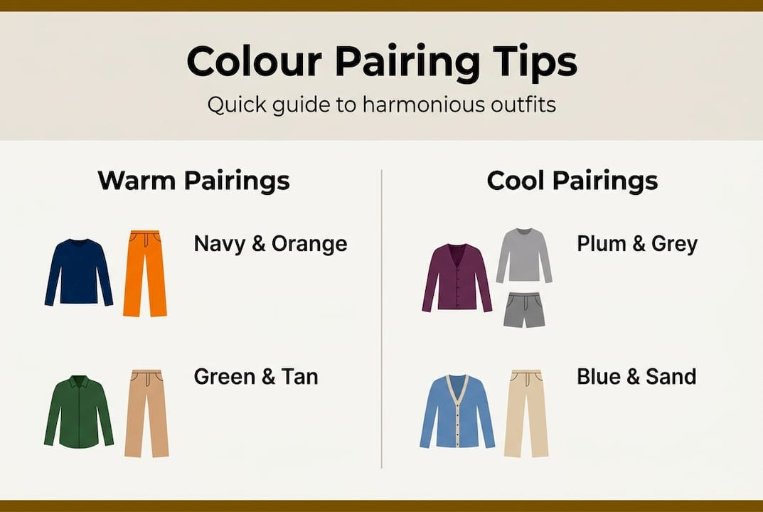
| Colour pairing | Wheel relationship | Best season | Mood created |
|---|---|---|---|
| Navy and burnt orange | Complementary | Autumn | Bold, grounded |
| Blush and mauve | Analogous | Spring/Summer | Soft, romantic |
| Olive and rust | Analogous | Autumn/Winter | Earthy, warm |
| Cobalt and white | High contrast | Summer | Fresh, crisp |
| Forest green and cream | Near-complementary | All seasons | Classic, elevated |
For more on how the colour wheel in fashion connects to current trends, it’s worth seeing how these pairings show up in seasonal collections.
Seasonal palettes: Adapting colour theory to your wardrobe
Now, with the basics in hand, let’s move to how you can adapt colour theory for your wardrobe season after season. The four-season approach categorises people into spring, summer, autumn, and winter types based on their natural colouring. It’s a helpful framework, but it’s not a cage.

Seasonal frameworks are helpful but not rigid. Modern approaches prioritise brightness hierarchy over hue alone, meaning how light or dark a colour is matters just as much as whether it’s warm or cool. A winter type doesn’t have to avoid all warm tones. She just needs to consider whether the brightness level works with her natural contrast.
| Season type | Classic palette | Modern twist | Key principle |
|---|---|---|---|
| Spring | Warm, light, peachy tones | Add pops of coral or golden yellow | Keep saturation medium to high |
| Summer | Cool, muted, soft pastels | Layer dusty rose with slate blue | Avoid very high contrast |
| Autumn | Warm, rich, earthy tones | Mix rust with forest green | Embrace depth over brightness |
| Winter | Cool, high contrast, jewel tones | Try icy lavender or bold cobalt | Lean into strong contrast |
Here are some fast ways to update your look using seasonal colours:
- Swap a neutral accessory (bag, scarf, or belt) for one in your season’s signature tone.
- Add a lip colour that aligns with your seasonal palette for an instant cohesion boost.
- Layer a seasonal-toned knit over a neutral base outfit to test a new palette without full commitment.
- Use nail colour as a low-risk way to experiment with bolder seasonal shades before adding them to clothing.
Pro Tip: Don’t just think about hue when shopping for seasonal pieces. Pay attention to how bright or muted a colour is. A muted version of a trendy colour will often work better across more outfit combinations than its vivid counterpart.
For a deeper look at what’s resonating right now, check out seasonal trends 2026 and get practical guidance on choosing seasonal outfits that are both on-trend and personal. Understanding seasonal collections and style also helps you shop more intentionally.
Beyond the rules: Personal expression and colour confidence
Adapting seasonal palettes is a great foundation, but individuality shines when you go beyond the standard rules. The most interesting outfits often come from someone who understood the rules well enough to know when to set them aside.
Modern preferences show the value in experimentation. Harmonious looks are not only about strict rules but about expression and alignment with your environment and mood. If you feel powerful in a colour, that energy reads. Confidence is visible, and it changes how any outfit lands.
When does breaking the rules actually work? Here are a few common scenarios:
- When you’re wearing a monochromatic look (all one colour family), traditional contrast rules don’t apply. The interest comes from texture and proportion instead.
- When you’re working with prints, the colours in the print often do the harmony work for you, so you can pull from any shade in the pattern.
- When your accessories are the focal point, you can use them to introduce a colour that technically clashes with your outfit but creates intentional, editorial tension.
- When your mood calls for it. Dressing for how you want to feel is a legitimate and powerful use of colour.
Signs you’re ready to expand your colour confidence:
- You’ve mastered your seasonal palette and feel bored by it.
- You find yourself drawn to colours outside your usual range and want to understand why.
- You’re comfortable with your undertone and want to experiment with contrast.
- You’ve started noticing how colour affects your mood and energy throughout the day.
Pro Tip: Start with one bold statement piece, a bag, a pair of shoes, or a scarf, in a colour that excites you but feels risky. This lets you test the combination without a full outfit commitment.
The role of trends in fashion is real, but your personal expression is what makes a trend worth wearing.
Our take: The real secret to mastering colour in fashion
Here’s something most colour guides won’t tell you: the women who dress best aren’t the ones who’ve memorised every rule. They’re the ones who’ve learned to trust both what the science suggests and what their gut says.
Too many resources in this space focus on restriction. Don’t wear this with that. Avoid this colour if you have this undertone. It turns colour theory into a source of anxiety rather than a creative tool. That’s backwards. The point of understanding colour is to feel more free, not less.
Small, intentional choices add up faster than you’d expect. Swapping one neutral piece for a considered colour, or learning one new pairing each season, builds real style instinct over time. You don’t need a degree in design. You need curiosity and a willingness to experiment without self-judgement.
We also think the shopping process itself deserves more attention. A faster shopping workflow that’s guided by colour knowledge means fewer returns, fewer regrets, and a wardrobe that actually gets worn. That’s the real win.
Enhance your wardrobe with colour-smart fashion essentials
Ready to put your new insights into practice? Knowing your colours is one thing. Having the right pieces to work with is another.

At 16th Avenue, we’ve curated collections with colour-conscious women in mind. If you’re building out your autumn and winter wardrobe, our autumn and winter coats come in a range of seasonal tones that pair beautifully with the palettes we’ve covered here. For beauty tools that help you extend your colour story from clothing to makeup, our makeup brush set gives you the precision to match your look from head to toe. Explore more colour-smart choices across our full collection and find pieces that feel genuinely like you.
Frequently asked questions
Does colour theory really affect how others perceive my style?
Yes, modern harmony preferences affect perceptions of how polished and confident your style appears. Well-matched colours signal intentionality, which reads as put-together even in casual outfits.
Can I use colour theory without being ‘artistic’?
Absolutely. Simple tools like the colour wheel and seasonal palettes help everyday users make better choices without any design background. Start with one pairing principle and build from there.
How do I start combining colours if I’m not sure what suits me?
Begin with combinations from your seasonal framework as starting points and build confidence by adding one bold piece at a time. Neutral bases make it easier to test new colours without overwhelming your look.
Why do some trendy colours not work on me?
Trendy colours might clash with your skin’s undertone, and not all trends suit every individual’s natural colouring. Personalising your approach through colour theory helps you identify what flatters you most rather than what’s simply popular.
Recommended
- How colour trends shape fashion and beauty style – 16th Avenue
- 6 Essential Fashion Tips for Women to Elevate Your Style – 16th Avenue
- Fashion Trends Guide 2026: Upgrade Your Wardrobe Easily – 16th Avenue
- Trends in Women’s Fashion 2026 – Impact on Everyday Style – 16th Avenue
- Styling tips for designer clothes: 5 expert essentials 2026 – MaraFormigone